Hyderabad toSeattle at 15.
I’m Uma, a UX researcher and product designer who studied at Iowa State. I start every project by listening to the people it is for.

Moving from India to the US: Hyderabad
I moved from India to the US at fifteen, from Hyderabad to Seattle with my family. New school, new routines, new rules nobody wrote down.
Seattle
Finding UX
I went in for the biology.I came out asking about the people.
During a bioengineering internship I kept noticing how people actually used the equipment and software around them: where they hesitated, what they worked around, what nobody had asked them. UX gave those questions a method, and I have been researching and designing since.
Off the clock
When I’m not designing, I’m usually moving.
Badminton
The game I play to switch off. A fast rally leaves no room to think about screens.
Telugu songs
I dance to them, the film songs I grew up with in Hyderabad, wherever there is room.
Travel
A newer passion: 2024 was the year I started. Photos from those trips are still to come.
How I work
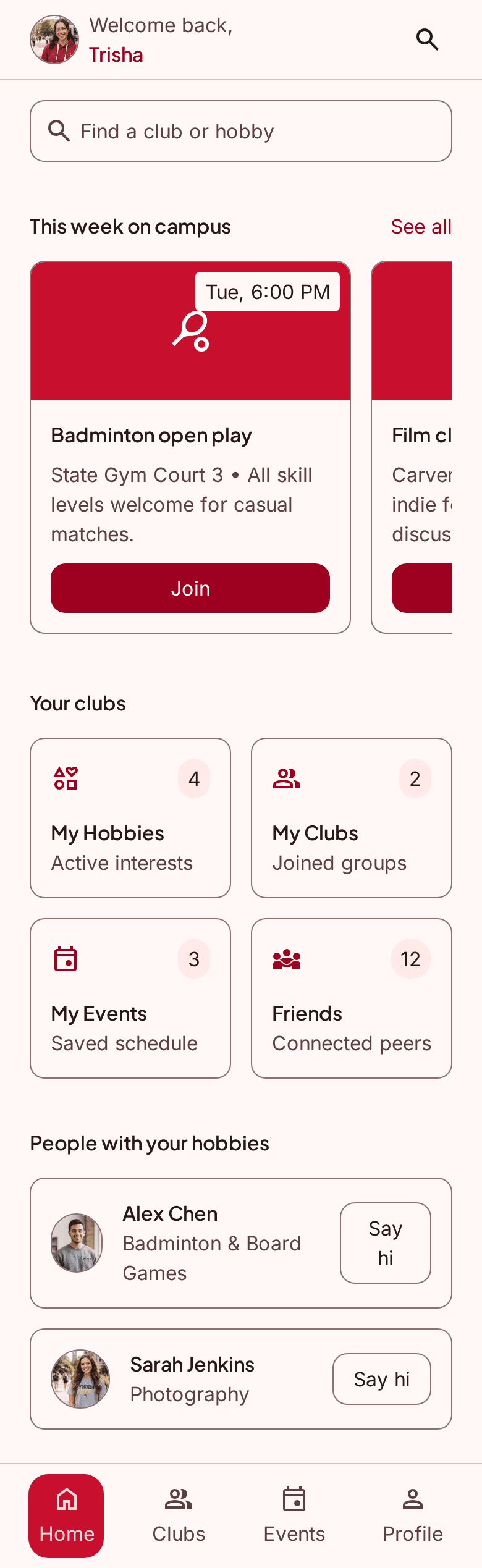
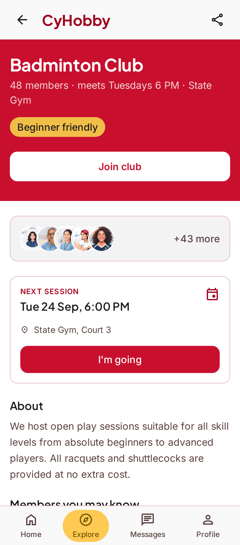
Four habits I bring to every project, and the two CyHobby screens they led to.
User-centred design
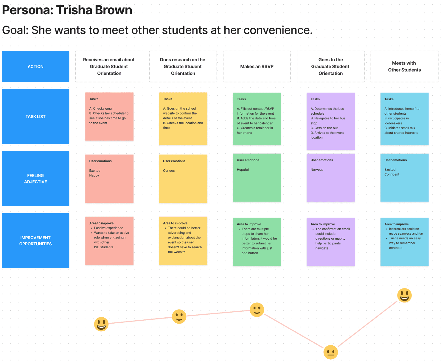
I start with the people who will use it: surveys, interviews, then a persona built from what they said.
Strategy-driven creativity
Before I sketch, I map the whole journey on sticky notes, from why someone starts to what keeps them going. The gaps in the map become the brief.
Aesthetics with purpose
Colour comes last. A grey screen has to make the next step obvious on its own: one clear button per screen. Only then does every colour and size earn its place.
Future-ready & scalable
I design with shared parts. Pages built from the same card mean a new module needs content, not a new layout.
Tools Ireach for
The bigger the name, the more often it is open on my screen.
Figma
Open every day: wireframes, prototypes and component libraries. Both of my case studies were designed and tested here.
Adobe Creative Cloud
Illustrator and Photoshop for icons, image editing and brand pieces.
HTML
Clear page structure, so a design can be built properly and read by a screen reader.
CSS
Layout, type and motion in the browser, to check that a design holds at every width.
JavaScript
Enough to build a working prototype and talk through a build with developers.